A Power BI analysis of hub capacity, driver performance, and fleet reliability, April 2023
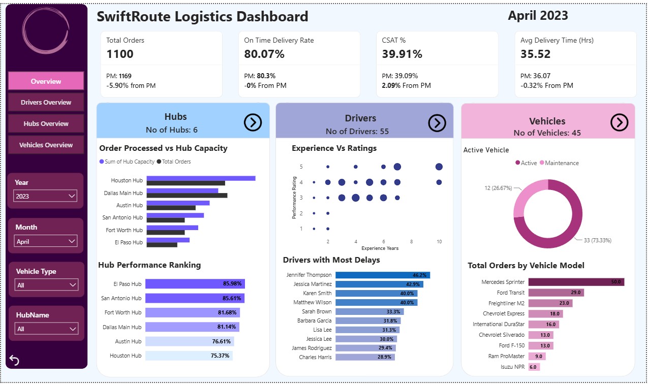
Business Demand Overview
- Reporter: The Operations Manager, SwiftRoute Logistics
- Value Change: Replace manual, month end spreadsheet reporting across hubs, drivers, and vehicles with a live visual dashboard that surfaces performance and reliability issues as they happen, instead of weeks later.
- Necessary System: Power BI, Hub order management system, Fleet/vehicle maintenance log, Driver roster and CSAT survey data.
- Other Relevant Info: Vehicle maintenance and breakdown records are currently tracked per hub in separate Excel files; driver ratings are collected through a post delivery survey; historical KPI baseline is available from January to April 2023.
User Stories
No # | As a (role) | I want (request/demand) | So that (user value) | Acceptance Criteria |
1 | Operations Manager (responsible for all hubs) | A network wide dashboard overview of total orders, on time delivery, CSAT, and average delivery time | I can catch a month over month decline in any core KPI before it becomes a trend, across the whole network | A Power BI dashboard showing all four KPIs with MoM % change, filterable by year and month, with full visibility across all hubs |
2 | Fleet Manager (responsible for all hubs) | A breakdown of vehicle reliability by model, code, and age, alongside order volume per vehicle type, across the full fleet | I can plan preventive maintenance and fleet replacement around actual breakdown risk, not just vehicle age | A Power BI dashboard filterable by vehicle type, showing breakdowns by model/code and an age versus breakdown scatter, with full visibility across all hubs |
3 | VP of Network Operations (responsible for all hubs) | A side by side view of every hub’s capacity, order volume, and performance ranking | I can spot cases like a high capacity hub ranking last, and decide whether the fix is a process audit or a capacity reallocation | A Power BI dashboard showing all 6 hubs simultaneously, ranked by performance, with capacity versus orders for each |
4 | VP of Customer Experience (responsible for all hubs) | A combined trend of CSAT against on time delivery rate over time | I can tell whether a delivery speed initiative is actually the right lever for improving customer satisfaction, or whether the two have decoupled | A Power BI dashboard trending CSAT and on time delivery rate together, network wide, with MoM comparison |
Required Data
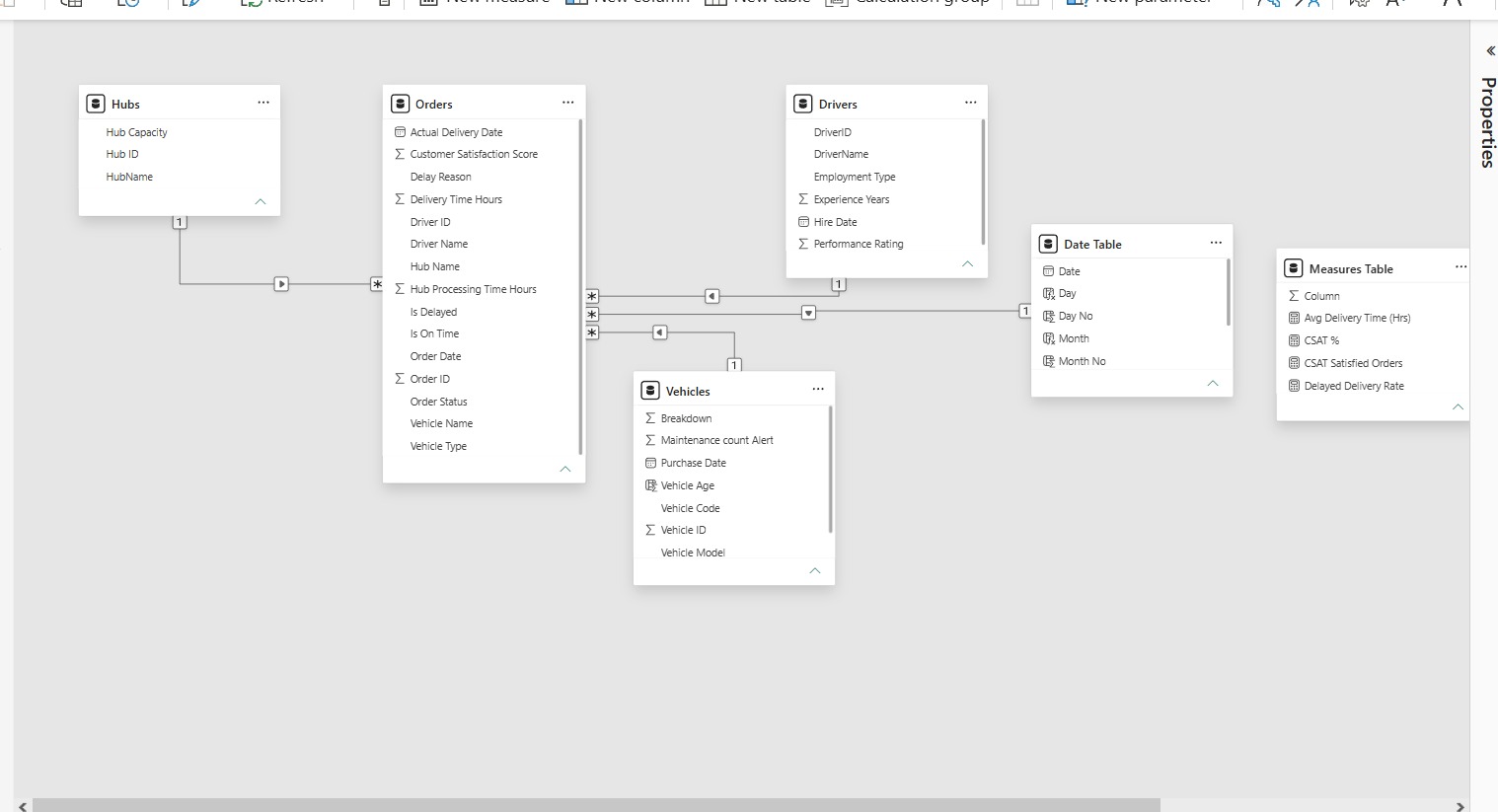
- Orders table: order ID, date, hub, assigned driver, assigned vehicle, delivery status (on time or late)
- Hub master: hub name, monthly capacity, region
- Driver roster: driver name, hire date, years of experience, performance rating, monthly delivery count
- Delivery log: delivery time (hours), on time flag, delay reason (where captured)
- CSAT survey results: score per delivery or per period
- Vehicle master: vehicle code, model, type, age, active/maintenance status
- Maintenance/breakdown log: vehicle code, breakdown date, breakdown count
1. The Business Problem
SwiftRoute Logistics runs a fleet of 45 vehicles, 55 drivers, and 6 regional hubs to move orders across its network. Leadership needed one question answered every month: is the network actually performing, and where should we intervene first?
To answer that, I built a four page Power BI dashboard (Overview, Hubs, Drivers, Vehicles) tracking four core KPIs month over month: Total Orders, On Time Delivery Rate, Customer Satisfaction (CSAT), and Average Delivery Time. Each detail page then breaks those KPIs down by hub, driver, and vehicle so the “why” behind the number is never more than one click away.
The April 2023 snapshot immediately surfaced a problem that a single headline KPI would have hidden: operations look fine, but customers aren’t happy.
2. The Headline Numbers
KPI | April 2023 | Prior Month | Change |
Total Orders | 1,100 | 1,169 | -5.90% |
On Time Delivery Rate | 80.07% | 80.3% | roughly flat |
CSAT | 39.91% | 39.09% | +2.09% |
Avg Delivery Time | 35.52 hrs | 36.07 hrs | -0.32% |
Two things stand out immediately. Orders dropped nearly 6% in a single month, and CSAT is sitting at just under 40%, even after a small improvement, still the weakest number on the entire dashboard by a wide margin. On time delivery, meanwhile, holds steady above 80%.
3. Insight #1: The Delivery and Satisfaction Disconnect
On time delivery of 80% is a respectable operational number. CSAT of under 40% is not. If timeliness were the main driver of customer satisfaction, these two metrics should move together. They don’t.
This tells us the CSAT problem likely sits outside of delivery speed: things like delivery communication, order condition, driver interaction, or handling of exceptions. A dashboard built only around on time delivery would have reported “green” status while the actual customer experience was failing. This is the clearest argument in the whole report for why CSAT needs its own root cause investigation rather than being treated as a byproduct of on time performance.
4. Insight #2: Hub Capacity Doesn't Equal Hub Performance
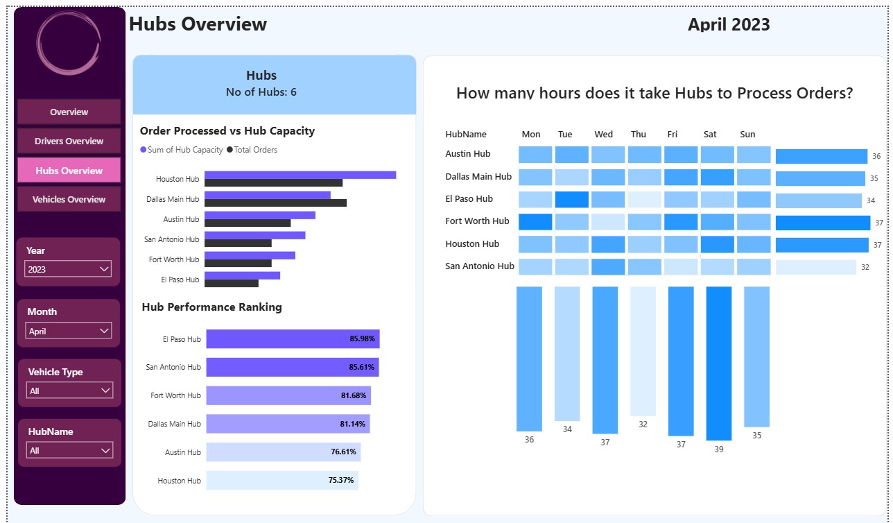
The Hubs Overview page ranks all 6 hubs by performance:
- El Paso Hub: 85.98%
- San Antonio Hub: 85.61%
- Fort Worth Hub: 81.68%
- Dallas Main Hub: 81.14%
- Austin Hub: 76.61%
- Houston Hub: 75.37% (lowest)
Here’s the paradox: Houston Hub carries the highest capacity and the highest order volume of any hub in the network, yet it ranks dead last on performance. El Paso and San Antonio, by contrast, run smaller volumes and post the two best performance scores.
This isn’t a capacity shortage. Houston has plenty of room on paper. It’s a sign that scale is exposing a process or management gap that doesn’t show up at the smaller hubs: something in how Houston handles its higher throughput (staffing patterns, order processing time, or handoff procedures) is dragging it down. The order processing time matrix supports this: Houston and Fort Worth both average 37 hours of weekly processing time, the highest of the six hubs.
5. Insight #3: The Fleet's Reliability Problem Is Concentrated, Not Uniform
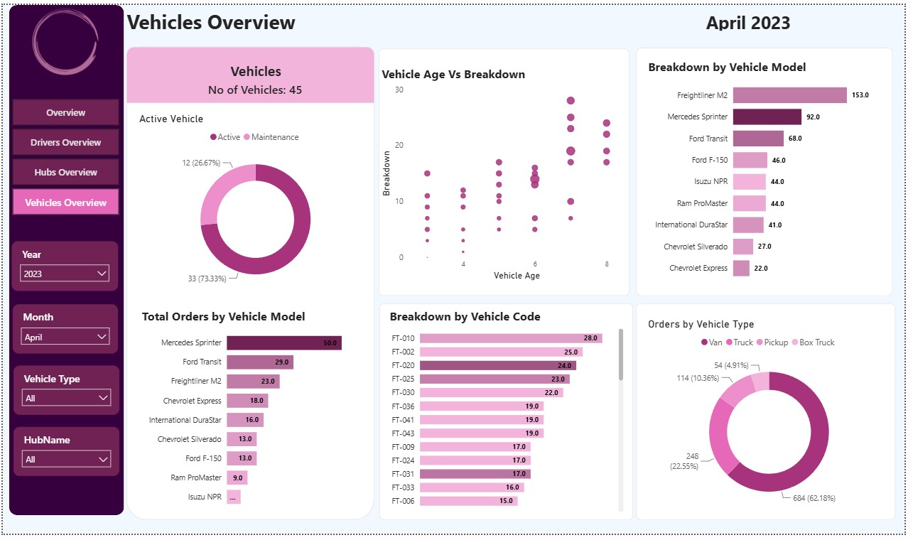
The Vehicles Overview shows 45 vehicles, with 33 active (73.3%) and 12 in maintenance (26.7%) at any given time, meaning over a quarter of the fleet is off the road.
Two patterns explain why:
- Vehicle age drives breakdowns. The Vehicle Age versus Breakdown scatter shows a clear upward trend: vehicles aged 6 to 8 years cluster at 15 to 28 breakdowns, while vehicles under 4 years old mostly sit under 15. Age, not brand alone, is a real predictor of failure.
- One model dominates breakdown volume. Freightliner M2 accounts for 153 breakdowns, more than the next two models combined (Mercedes Sprinter at 92, Ford Transit at 68), despite handling only 23 total orders, far fewer than Mercedes Sprinter’s 50. Mercedes Sprinter is the fleet’s workhorse (highest order volume) and its breakdown count scales roughly with that use. Freightliner M2’s breakdown rate does not scale with its usage; it breaks down far more than its workload would predict, which points to an issue specific to the model rather than simple overuse.
Vans handle the large majority of orders (684 orders, 62.2% of volume), so any reliability issue in van class vehicles like the Sprinter or Freightliner has outsized impact on the whole network.
6. Insight #4: Delays Are Concentrated in a Small Group of Drivers
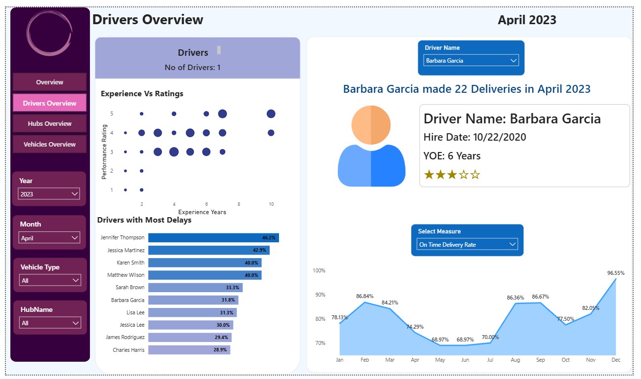
The “Drivers with Most Delays” ranking shows a clear top tier: Jennifer Thompson (46.2%), Jessica Martinez (42.9%), Karen Smith and Matthew Wilson (40.0% each) sit well above the rest of the roster, where delay rates taper into the 28 to 33% range. The Experience versus Rating scatter shows performance ratings cluster around 3 to 4 stars regardless of experience level. Tenure alone isn’t predicting quality, which means delays are more workable through coaching and route/hub assignment than through simple seniority based fixes.
Recommended Action Plan
- Run a Houston Hub process audit before adding more capacity anywhere else. Since Houston already has the highest capacity in the network but the worst performance score, the fix is operational, not infrastructural. A focused audit of Houston’s order processing workflow, staffing levels during peak hours, handoff time between processing stages, and a comparison against El Paso and San Antonio’s leaner processes, should be the first project, ahead of any decision to expand hub capacity elsewhere.
- Launch a targeted reliability review of the Freightliner M2 fleet and set an age based maintenance trigger. Given that Freightliner M2 produces breakdown volume disproportionate to its order load, and that breakdowns rise sharply once vehicles pass 6 years old, SwiftRoute should (a) pull maintenance records for the Freightliner M2 subfleet specifically to isolate a parts, model, or duty cycle issue, and (b) move vehicles aged 6+ years onto a shortened preventive maintenance interval instead of the standard schedule. This directly targets the 26.7% of the fleet currently sitting in maintenance rather than on the road.
Both actions are deliberately scoped to root causes the data actually supports, hub level performance and vehicle level reliability, rather than the CSAT number itself, since CSAT’s true drivers (communication, order condition, service interactions) aren’t captured in this dataset and would need their own investigation, likely through a customer feedback or complaints category dataset, as a logical next step.
8. How It Was Built
- The dashboard was built in Power BI with DAX measures for month over month comparisons (current month, prior month, and % change) driven by Year/Month/Vehicle Type/Hub slicers, so every KPI on the Overview page recalculates against whatever period is selected. The Drivers page also includes a driver profile card that pulls a single driver’s hire date, experience, rating, and monthly on time trend on selection, useful for one on one coaching conversations, though it’s worth flagging as a design note that the driver count card on that page reflects the filter context of the selected driver rather than the full roster, a reminder to always sanity check KPI cards against slicer context during QA.